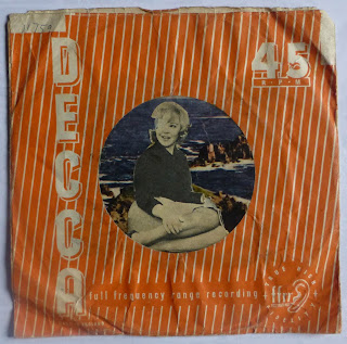
THE JACKSON 5 "I'll Be There" / "One More Chance" 1971
 In 1971 logos were usually the preserve of the prog bands.
 Angular, heraldic or biomorphic, they spoke to male fixations of sex, power, superiority and complexity.
Using graphic styles inherited from the 60's
underground and then diluted to be at least readable, they lent themselves to careful analysis and faithful reproduction. Rendered halfway accurately, they could signal across a crowded comprehensive school playing field from the back of an army store rucksack.
In the world of pop, logos were rare. The Jackson Five's wasn't always used even by their record company, but the fans picked up on it and drew it into their own vocabulary of intimacy and emotional investment in the groups joyuous, consoling music.
You saw it on smaller, personal items; Pencil Cases, Diaries and School Jotters where it jostled with coded messages and names of friends picked out in a soft-block lettering. This was appropriated from the bubblefonts of post-hippy ad campaigns and resembled leaning rows of cushions, or squashed - and - shaped Opal Fruits. Usually linear, these tributes were drawn with multicoloured felt pens; when blocked-in they became streaky and less of a piece. Not because of any lack of effort from the artist, but due to the blotchy imperfections of the pens.
This sleeve was first constructed from stout cartridge paper - swiped from the art classroom?- and then carefully decorated in a version of the Shaped Opal Fruit style.
It sings of the welcome, immersive distractions of pop; of sunday afternoons in an upstairs room, with homework undone and school clothes hanging ready; of the weekend and its promise fading out under the chart rundown, muffled family rows, barking dogs from down the street, and shouted reminders about that homework.

Comments
Post a Comment